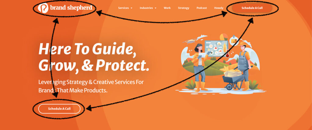
shepx blog: website hero best practices

top of the world: website hero area best practices

We all scroll.

There exists no website in which a person lands and does not scroll.

A better way to understand the top part of a webpage is to see it as a greeting between two people.

It’s the “hello” followed by a handshake or fist bump.

When we meet people, we give them time to know more about them than a “hello” and a handshake.

The same goes for the top of a webpage. It’s there as the first greeting, but your visitor will scroll to get to know your brand better.

So, what should we do?

Let’s explore tried and tested best practices for the top of web pages.

The Hero

First, let’s understand the crucial phrase: The Hero.

The Hero of a webpage refers to the top section, even if viewing all of it requires some scrolling.

The Hero also includes a navigation bar.

The Hero is what we are covering here.

Triangle Theory

Years of studying webpage performance heat maps led to an insight: People look at the hero in a triangle pattern.

I developed a working theory and put it to the test.

I recognized a pattern: People view the hero’s top left, top center, and middle sections.

I tested my theory, Triangle Theory, on my websites and watched to see if I could direct traffic.

The center of the theory is that a person visits a website for a need or curiosity. However, the brand behind the website has a say in where that visitor is likely to go.

We do this by having a single primary call to action (CTA) and using secondary CTAs sparsely.

When the Triangle Theory is applied, the brand logo is in the top left, the primary CTA is in the upper right, and the primary CTA is repeated in the middle.

The middle CTA plays off of the hero headline. Its specific placement only needs to follow the website styles for text justification.

So, if your headlines are center-justified, the CTA should be centered on the hero.

If your headlines are left justified, do likewise with the hero middle CTA.

In my experiment, I wanted to drive more traffic to my appointment scheduling page. By repeating the “Let’s Meet” CTA, I saw increased traffic to that page.

Since then, I have applied Triangle Theory to many websites with similar results.

Triangle Theory is a simple and effective way to help visitors understand their brand preferences.

Mobile First

When creating and assessing a webpage’s hero, always start with its mobile presentation.

The average website receives 60% of its traffic from a mobile device, with laptops and tablets sharing the difference.

The mobile design gives us the gift of forced brevity. We cannot be wordy or use a background image crucial to the story.

We must be pithy. We must be concise with our greetings because a mobile screen cannot accommodate anything else.

social media mistakes on a website header by shepx


Diminish Social Media Icons

Your brand has worked its ass off to get the visitor.

Real money has been spent on AdWords and promotion posts.

Brand stakeholders have been told about the website via networking and sharing brand content.

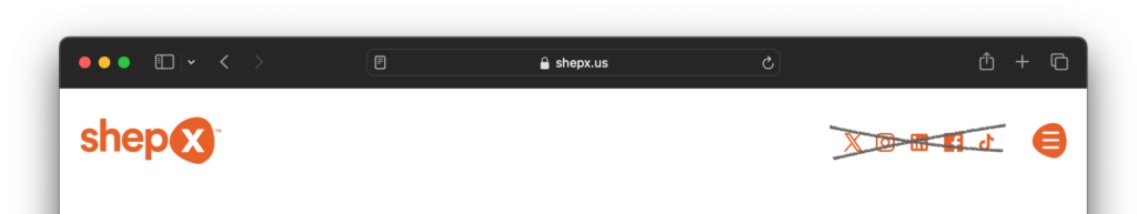
Why, in the name of all that is good and logical, would we show social media icons in the hero?

Let me be blunt: when a visitor takes you up on your tempting offer to head over to Instagram to visit your brand’s profile, they will see a notification, get the endorphin hit, and are gone.

You gave away money for no return at all.

three bonus points

We have covered the four significant ways to improve the top of web pages. If you only address those four things, you will have given your visitors a better experience than they had before.

If you want some finishing touches, consider these as well:

  • Do not use “We” in the hero headline. The current era of brand messaging is 100% customer-focused. No one cares about your brand…yet. They are on the website to see what your brand can do for them. Answer it without the words “we,” “us,” or for personal brands, “I.”
  • Background images are essential, but not in the way you think they are. The background image is there to set the tone, not to sell anything. It needs to be cropped in all sorts of ways for responsive browser display, so even by necessity, it cannot be vital to selling your wares. Instead, use an on-brand image that gives the words and CTA the right brand vibe.
  • There is no auto-playing video for mobile. This should not be said in the 2020s, but it still happens and is a giant middle finger to your visitor’s mobile data plan. Doing this costs your visitor money to visit your website. They bounce – as they should.

For more tips about improving website visitors’ experiences, please peruse our Insights section. If there is a topic you would like our input on, send us a message.

Continue reading

what is your process for creating websites?

when should we redo our website?