We all scroll.
There exists no website in which a person lands and does not scroll.
A better way to understand the top part of a webpage is to see it as a greeting between two people.
It’s the “hello” followed by a handshake or fist bump.
When we meet people, we give them time to know more about them than a “hello” and a handshake.
The same goes for the top of a webpage. It’s there as the first greeting, but your visitor will scroll to get to know your brand better.
So, what should we do?
Let’s explore tried and tested best practices for the top of web pages.
First, let’s understand the crucial phrase: The Hero.
The Hero of a webpage refers to the top section, even if viewing all of it requires some scrolling.
The Hero also includes a navigation bar.
The Hero is what we are covering here.
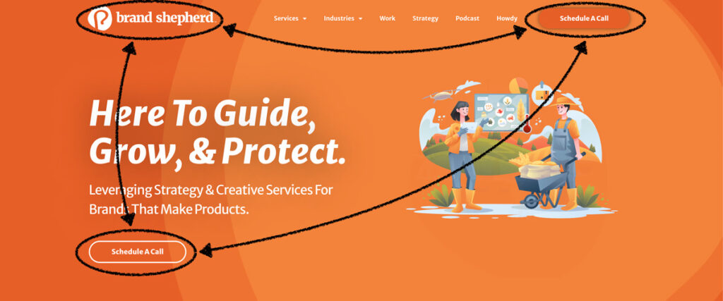
Years of studying webpage performance heat maps led to an insight: People look at the hero in a triangle pattern.
I developed a working theory and put it to the test.
I recognized a pattern: People view the hero’s top left, top center, and middle sections.
I tested my theory, Triangle Theory, on my websites and watched to see if I could direct traffic.
The center of the theory is that a person visits a website for a need or curiosity. However, the brand behind the website has a say in where that visitor is likely to go.
We do this by having a single primary call to action (CTA) and using secondary CTAs sparsely.
When the Triangle Theory is applied, the brand logo is in the top left, the primary CTA is in the upper right, and the primary CTA is repeated in the middle.
The middle CTA plays off of the hero headline. Its specific placement only needs to follow the website styles for text justification.
So, if your headlines are center-justified, the CTA should be centered on the hero.
If your headlines are left justified, do likewise with the hero middle CTA.
In my experiment, I wanted to drive more traffic to my appointment scheduling page. By repeating the “Let’s Meet” CTA, I saw increased traffic to that page.
Since then, I have applied Triangle Theory to many websites with similar results.
Triangle Theory is a simple and effective way to help visitors understand their brand preferences.
When creating and assessing a webpage’s hero, always start with its mobile presentation.
The average website receives 60% of its traffic from a mobile device, with laptops and tablets sharing the difference.
The mobile design gives us the gift of forced brevity. We cannot be wordy or use a background image crucial to the story.
We must be pithy. We must be concise with our greetings because a mobile screen cannot accommodate anything else.
Your brand has worked its ass off to get the visitor.
Real money has been spent on AdWords and promotion posts.
Brand stakeholders have been told about the website via networking and sharing brand content.
Why, in the name of all that is good and logical, would we show social media icons in the hero?
Let me be blunt: when a visitor takes you up on your tempting offer to head over to Instagram to visit your brand’s profile, they will see a notification, get the endorphin hit, and are gone.
You gave away money for no return at all.
We have covered the four significant ways to improve the top of web pages. If you only address those four things, you will have given your visitors a better experience than they had before.
If you want some finishing touches, consider these as well:
For more tips about improving website visitors’ experiences, please peruse our Insights section. If there is a topic you would like our input on, send us a message.
® Brand Shepherd llc • shepx is part of the Brand Shepherd herd of brands.
Steel suppy is a business of relationships and jm burns steel supply wanted the website to give buyers a sense of the competency and personality they will be working with.
JUSTIN ROBBINS – CEO, JM BURNS STEEL SUPPLY
Showcase a woman-owned steel trading business that has carved out a reputation of quality service.
Steel trading is a business of relationships and DST wanted the website to give buyers a sense of the competency and personality they will be working with.
As a woman-owned business, DST wanted the website to showcase the credentials awarded and by doing so, show new credentialing agencies of the brand’s trustworthy nature.
“jane, the owner, has created a brand that is a force to be reckoned with in a heavily male-dominated industry. crafting her brand’s website was a true honor to see come to life.”
dan crask – shepx
the website needed to be the handshake between academic scientific innovation and the capitalism marketplace.
“building the benanova brand was rewarding because we were entrusted to first craft their visual brand identity and then apply it to a robust website.”
dan crask – shepx
To eat at the half-day Cafe is a vibe unto itself. The goal was to give website visitors an experience consistent with what they’ll get during their meal.
The people of Cincinnati live and support their vast number of independent restaurants like Half Day Cafe.
Those visiting Cincinnati either know in advance or find out quickly of the great food scene. Discovering new independent restaurants is a priority for them.
“we have had the great honor of building, growing, and protecting the half day cafe website since 2008. the honor is double because their food is incredible!”
DANIEL CRASK – SHEPX
create a website that insurance professionals in need of specific data via forms can access quickly and easily.
berkshire advisor resource is a specific insurance professionals’ go-to resource for help, so long as all of the information is provided efficiently. this puts a lot of emphasis on how customers interact with the website.
the data the insurance professionals provide has to be accessible in a way that is not a time-drain on the overall process so that the specialists can get the data in the right hands.
berkshire staff need a website that is a living, breathing tool between their customers and the valuable information they rely on. everything hinges on how well the website can collect and provide data.
“They key to success with the Berkshire website was in the design of the forms. We did a deep dive into their forms and redesigned their flow for the most efficiency for everyone.”
DANIEL CRASK – SHEPX
homes require on-going maintenance to prevent costly repairs, yet many homeowners are either uninterested or unaware of every point of maintenance a home needs. simple fix handyman is a handyman service designed to make home maintenance easy and affordable for home owners.
property owners are all too familiar with the many needs for maintenance that their properties require. simple fix handyman is a service for property owners to outsource those needs so property owners have one less thing to take care of.
“I have never had anything less than an extraordinary experience. shepx are phenomenal. I will never work with anyone else when it comes to building a website!”
Adam Markesbery – Simple fix handyman
create a website that sums up the it services prospera provides while also making access to support easy.
“prospera went from an underperforming website with a lot of pages to a single-page website that surpassed expectations because we took time to understand what prospera’s customers would find most valuable from their website.”
DANIEL CRASK – SHEPX
A website experience for a top tier copywriter, without blasting the reader with verboseness.
Emilie works with a lot of brand managers and so we learned from her experience that they are usually short on time. They want a copywriter who can get to the point and do so with absolute clarity.
Business owners who see the need and value of a copywriter of Emilie’s quality are people who have tried to write concise content but found out it is very challenging. They need to see expertise in a short period of time
“Knowledgeable, outgoing and strategic, Brand Shepherd is always up to date on technology and important business-building trends.”
EMILIE D’AGOSTINO
create a website that evokes the true in-person brand experience for this one-of-a-kind title agency.
the knoxville, tennessee real estate market is hot and premier title group goes to great lengths to ensure home buyers and sellers feel right at home.
a hot real estate market is keeps its heat in large part to the realtors® who create the best deals for everyone.
ultimately, all parties involved need lenders who know what they’re doing and premier title group set out to attract partnerships with knoxville’s best lenders.
“ptg’s website was such a breath of fresh air because they truly wanted to disrupt what real estate title agencies typically feel like and do so with warmth and authentic joy. this is how a brand stands out in a hot market.”
DAN CRASK – SHEPX