shepx assumes that many websites we build are going to be viewed on a mobile device first.
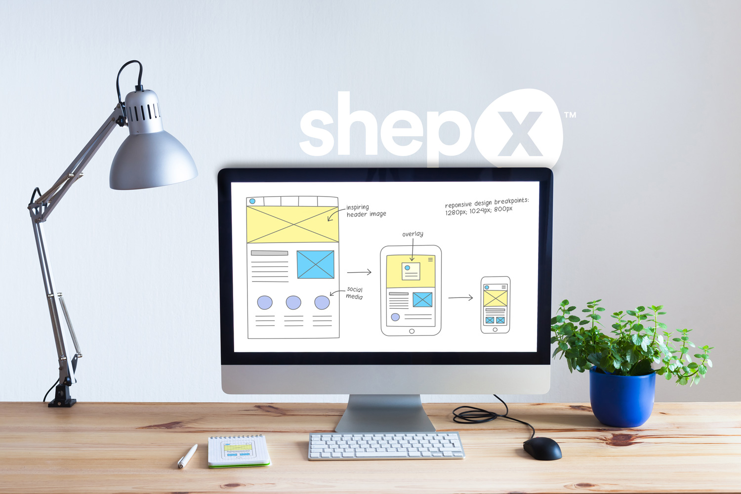
Despite that, we design every website as a desktop-first experience.
That may seem counterintuitive, but desktop-first design sets the foundation for the most effective user experience across all platforms – desktop, tablet, and phone.
There are three reasons why this process is not just strategic, but essential for many of our projects.
Desktop design is a more complex puzzle than mobile design. Phones and tablets are naturally limited by their screen size. On a desktop, the space is larger, and that means more intricacy in guiding the user’s eyes through the experience.
Think of desktop design as laying out the feng shui of a large room.
When you have a large room, it takes more effort to design a flow that both looks great and feels natural to navigate.
If you can nail the design for a large, open space, arranging for mobile becomes simpler. It’s far easier to scale down than to try and blow up a mobile design into something that works on a widescreen monitor.
Desktop design solves a website’s biggest challenge first so every version of the site is polished and professional.
If you’re a B2C brand, mobile is king. But for B2B websites, the desktop still rules the office.
shepx designs for a lot of B2B brands where customers visit websites during the workday from laptops and desktops. These websites often need to present detailed information about a product or service with complex specs, multi-layered navigation, and extensive dashboards.
Designing these features for desktop first aligns the website environment with these customers’ behaviors and expectations.
That’s not to say B2B mobile users aren’t growing in number – they are, and mobile design remains ever-important. But a significant portion of B2B buyers are still sitting at a desk, working on a computer. Desktop-first design meets them where they are.
The third reason we design desktop-first is simple: many features just work better there.
Take videos, for example. On mobile, many browsers block auto-play. If video is an important element of communicating how your product or service works, customers lose that brand experience on their phones and tablets.
Other elements, like complex dashboards and high-resolution images, are better suited for the wider canvases of a desktop. Mobile screen size limits not just the space you have to use features, but how you can use those features effectively.
Even tech giants like Google recognize this – they limit the number of features you can interact with on their mobile products compared to their desktop products.
By starting with desktop, we design with the full array of rich features available to users. Then, we scale them down for mobile, rearranging what works while respecting the limitations of smaller screens.
At the end of the day, desktop-first design is about strategy. Scaling down a desktop website to its mobile experience is the most efficient way to create a website that converts visitors into customers.
It’s not about chasing trends or picking sides in the desktop vs. mobile debate. It’s about solving the biggest challenge first. The result is a website that looks great, functions seamlessly, and serves every user.
Want a better website that works across every device? Start with the biggest canvas. Reach out to shepx, and we can help create a design that works everywhere your audience is.